Using immersion learning to reinvent language apps — A Refold case study
My Role
Project overview
As someone learning Japanese, I experienced the inconveniences of numerous ‘best’ approaches to language acquisition that didn't work. Different methods later, I wanted something that was fun, engaging, and flexibly catered to my daily schedule, and work.
Refold was a new language acquisition method that combined SRS learning with Immersion Learning (consuming native content). It was a modernised approach that strayed away from textbook learning.
I ultimately chose the Refold, however, it required multiple tools to be used together. This got me thinking; what if all these tools were combined into one centralised app?

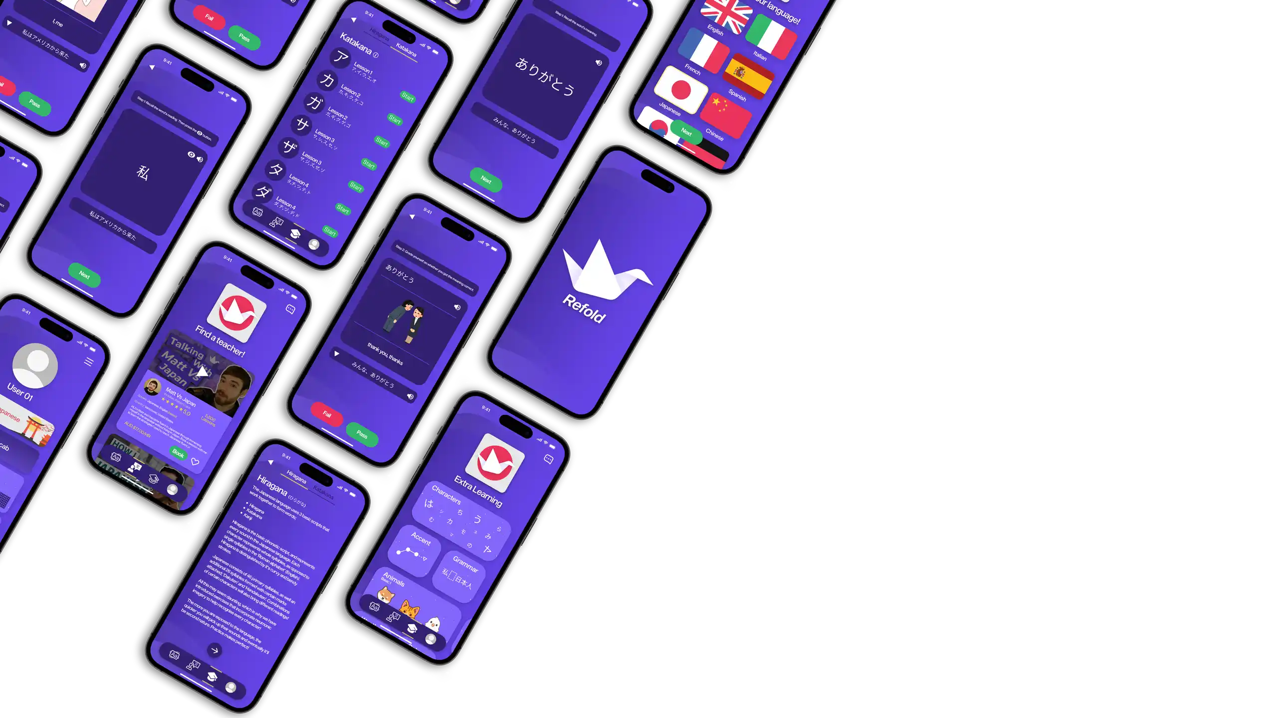
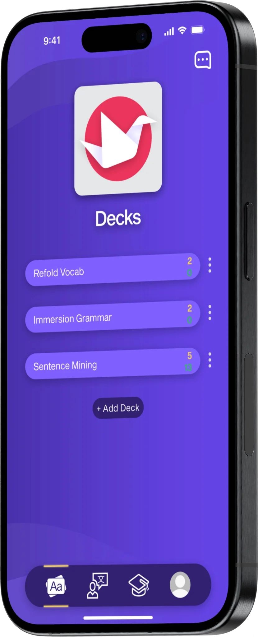
0.1
Refold mockup 01.
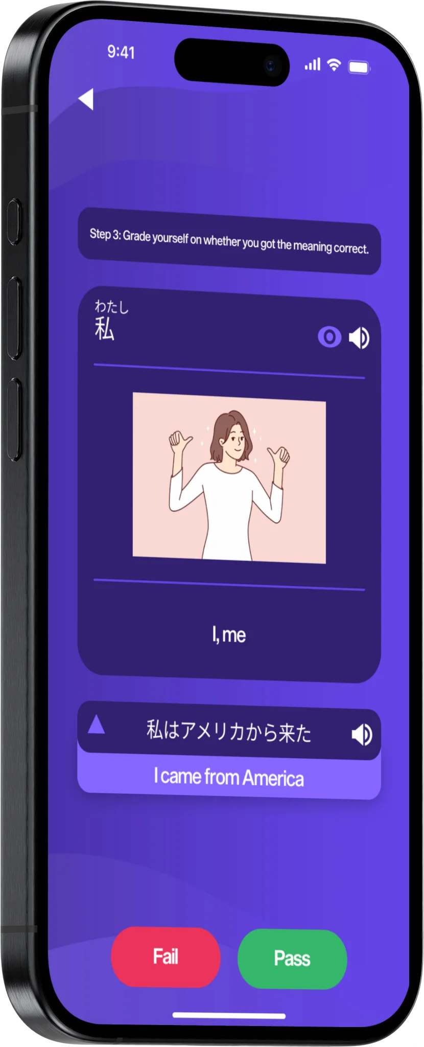
0.2
Refold mockup 02.
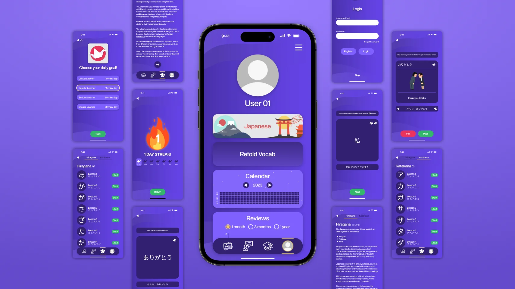
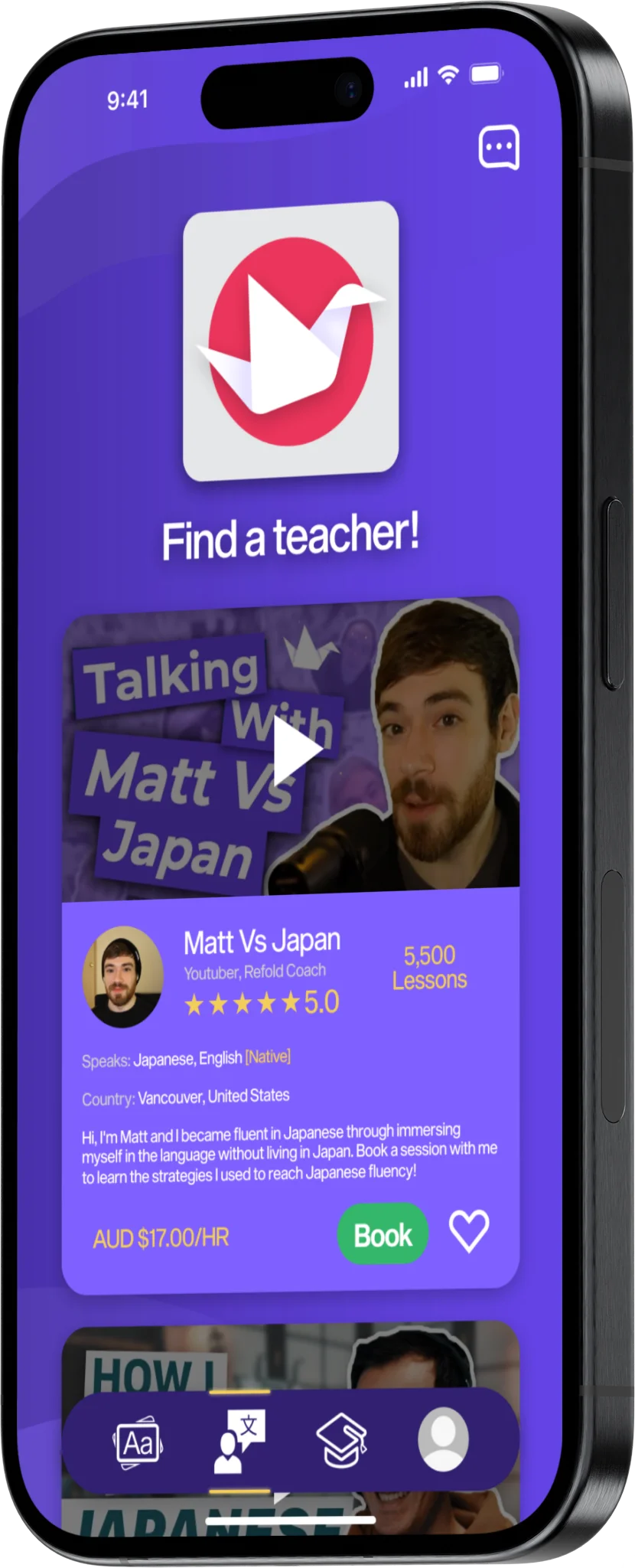
0.3
Refold mockup 03.
• USER RESEARCH
An opportunity for Refold to go out with a bang!
How do they prefer to learn?
The objective was to understand the frustrations of users beginning their language-learning journey and utilise findings from research to create a fully functional app that embodied the ideologies of Refold.
One way to do that was interviewing and surveying the current market. Key areas I established for these interviews and surveys were to figure out:
What are the challenges beginners are facing?
What learning methods are considered important?
What prevents users from learning?
What would be the main goal of learning another language?
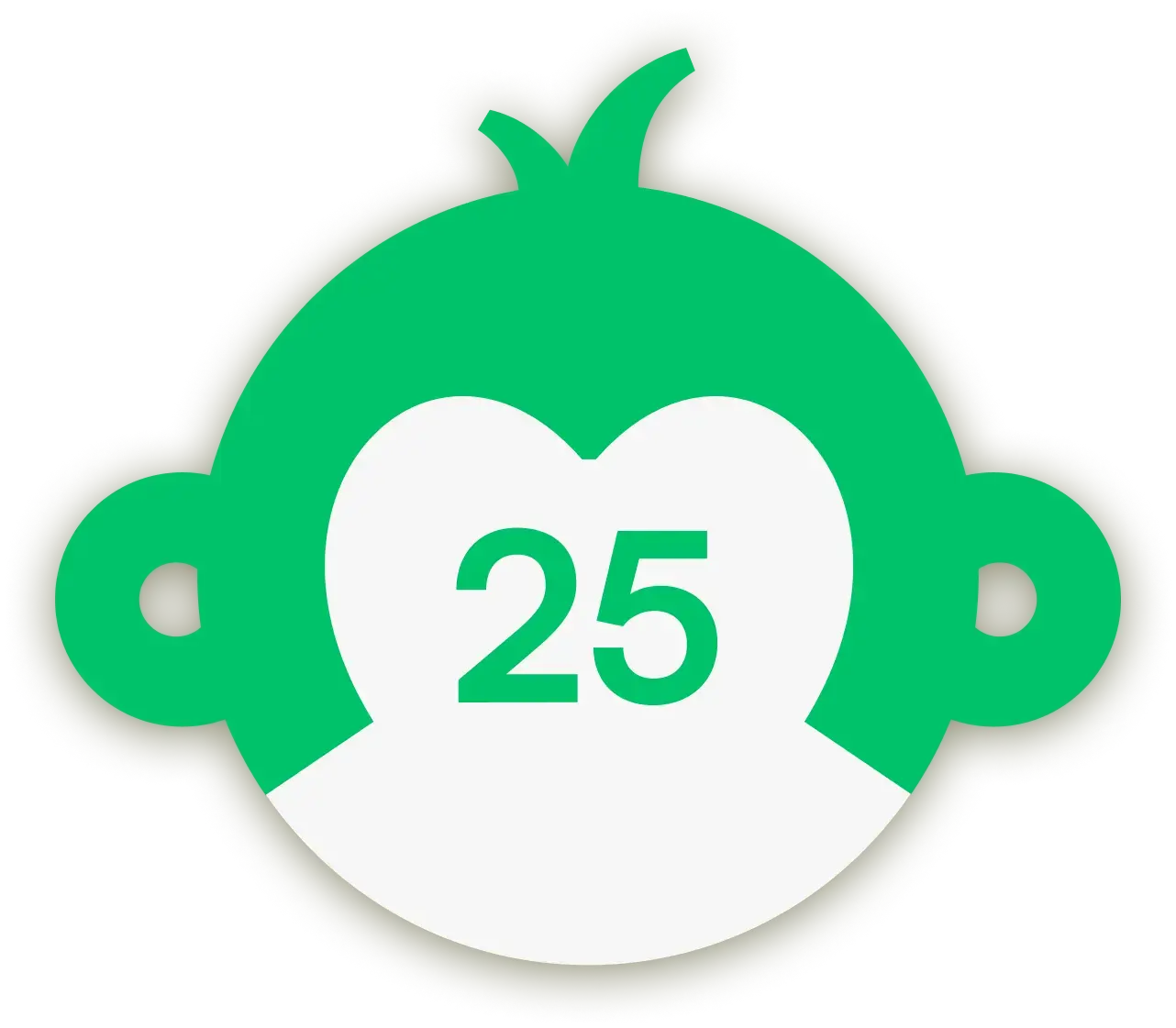
All 25 respondents revealed strong interest in learning a new language.
Surprisingly, they chose to learn through immersion/visiting the country instead of the traditional grammar textbooks.
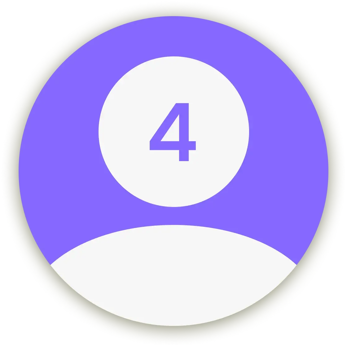
Interviewees consisted of 2 experienced learners and 2 unexperienced learners.
All participants pushed for daily listening of the target language, whilst textbooks be a supplementary learning.
Pinpointing opportunities.
From the extensive list of issues raised following my interview and survey results, I categorised them into 3 different themes for my Affinity Map; Experience/Observations, Wants/Needs and Issues.
3x main insights would be the centre of my attention:
Make the process less “study-like”, an activity that users find joy in using.
Flexibility is a must to cater to fluctuations in schedules, moods, motivations.
Mix between learning vocab/grammar and immersion.

1.0
Refold affinity mapping.
Introducing Lillian — Japanese culture enthusiast.
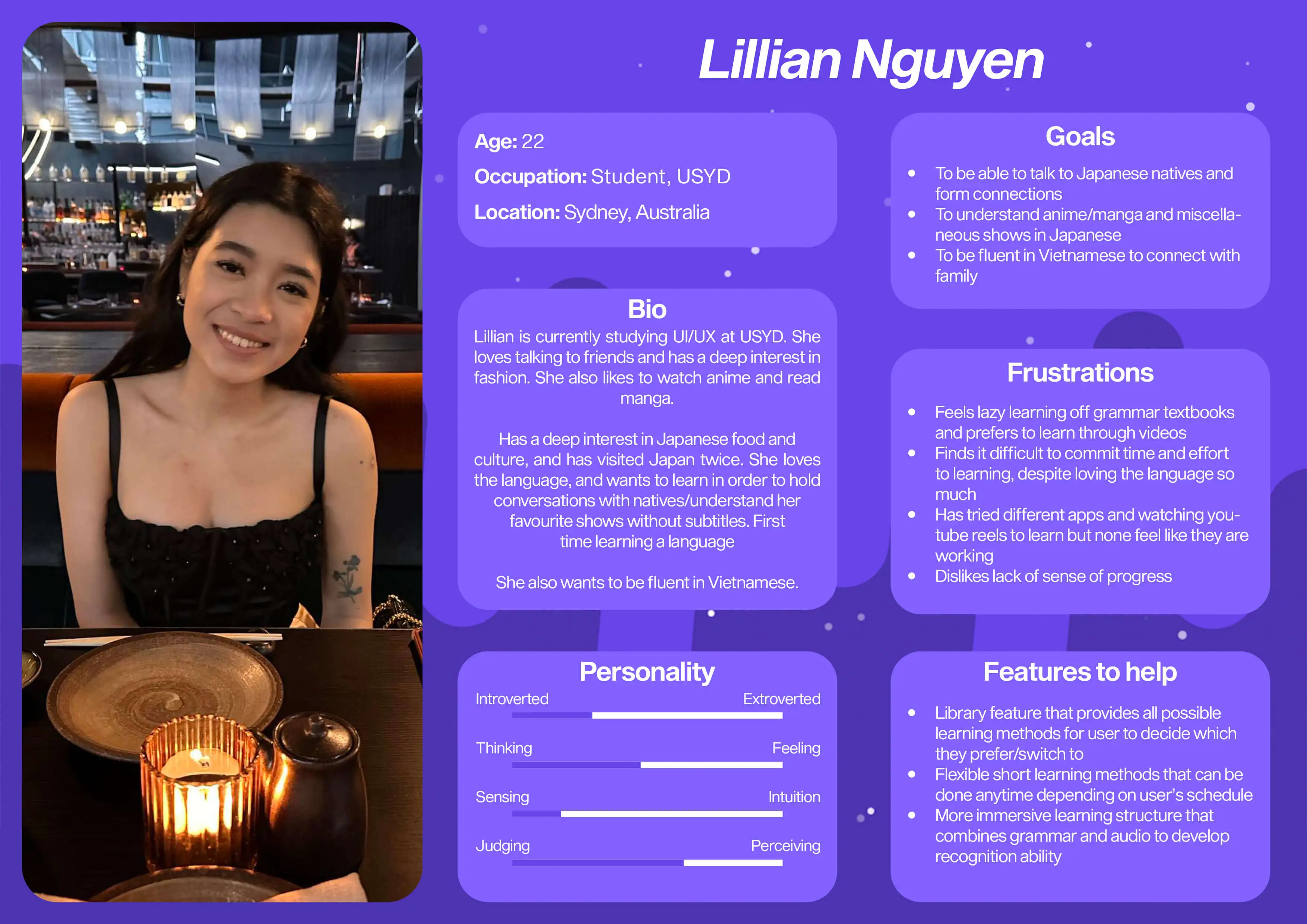
2.0
User persona 'Lillian'.
• REFLECTION
Reflecting on my research
Starting this case study, I still assumed language textbooks were the go to for many students. My surveys and interviews quickly made me realise that the market preferred immersing in the culture and language than solely learning from textbooks or classes. However the struggle was DEDICATION and COMMITMENT to learning.
This observation made me alter my approach to focusing on creating an app that could FLEXIBLY cater to the schedules of users, all whilst fostering a sense of PROGRESS and ACHIEVEMENT.
• IDEATING SOLUTIONS
Creating Refold's first app blueprint.
Prioritising the main issues.
Before designing mock iterations of the app, I knew it was important to give myself a clear solution to work towards.
HMW (How might we) statements not only gave me an open-ended question that provoked various approaches, it gave the opportunity to test and explore these solutions and visualise what clearly worked.
HMW 01
How might we facilitate a language learning app that flexibly caters towards a users daily schedule. mood, and motivations.
HMW 02
How might we create a user-friendly UI that lessens distraction and increases focus and motivation on learning the language.
HMW 03
How might we create a language learning app that gives users a sense of progression through their journey.
Traditional ideating at it's most effective.
With so many ideas, I found it difficult to prioritise which solutions would be the most viable for the app. That’s why MVP’s were such a valuable tool as it helped visually differentiate what could be achieved now with maximal importance, rather than waste time developing a feature that didn’t have much impact on the end result.
This then allowed me to finally sketch up quick paper UI designs I envisioned and ultimately translate them into storyboards of how users interacted with the Refold app.
3.0
MVP's, Crazy 8's and Storyboards.
Designing the architecture.
I revised the information architecture for flexibility without losing focus and motivation. I designed the journey from launch to learning to be simple and straightforward, aiming to lessen distraction and increasing progression.
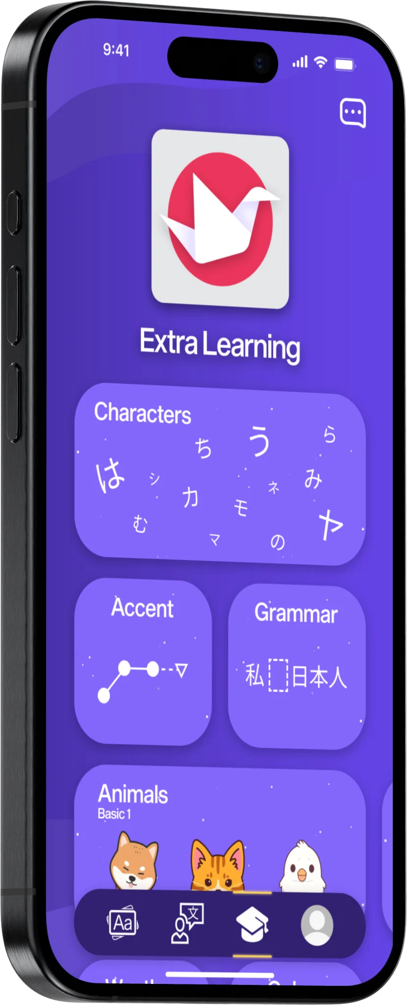
Extra learning curriculars such as coaching and general knowledge were included for users who wanted to further their learning.
4.0
Information architecture V2.
• STYLES AND COMPONENTS
Retaining Refold's beautiful branding styles.
Evolving the interface — branding and styles.
I made sure to adhere to ideal design practices used within the industry, creating branding and style guides that reflected Refold’s brand and identity.
I decided to continue their visual style by referencing their existing website, incorporating their strong visual purple designs and assets as components in my Figma file, ensuring UI consistency.
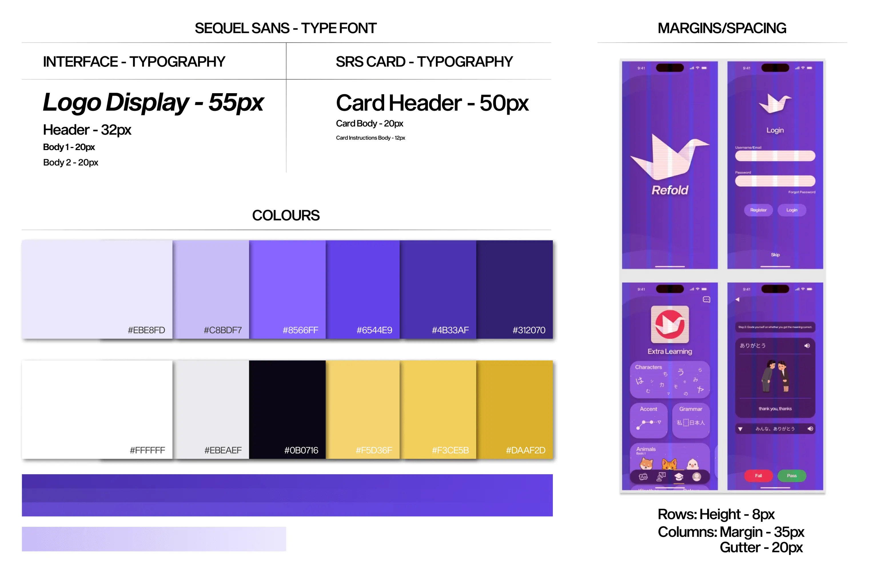
5.0
Branding and styles page.
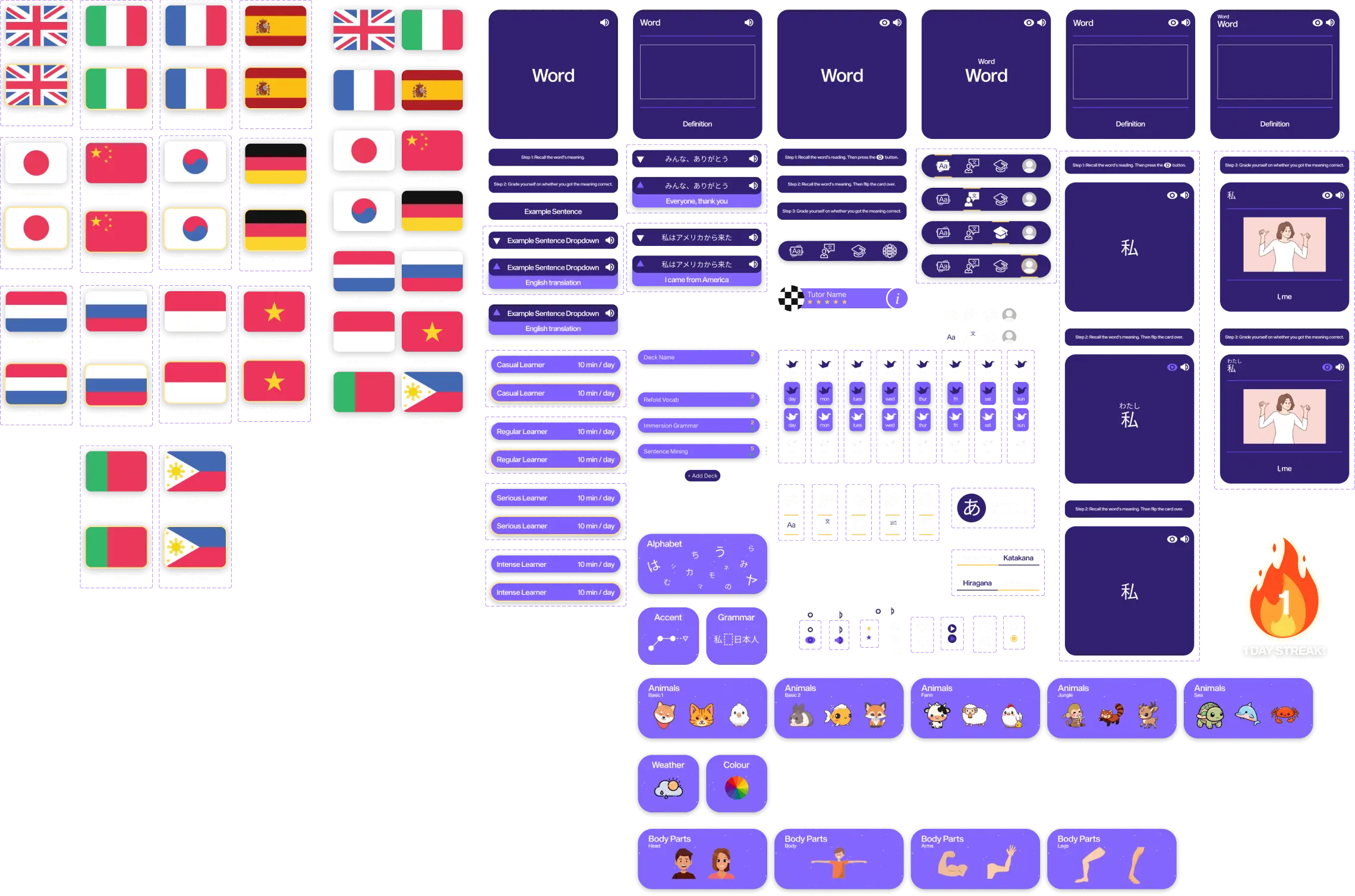
5.1
Component library.
• FINAL DESIGNS
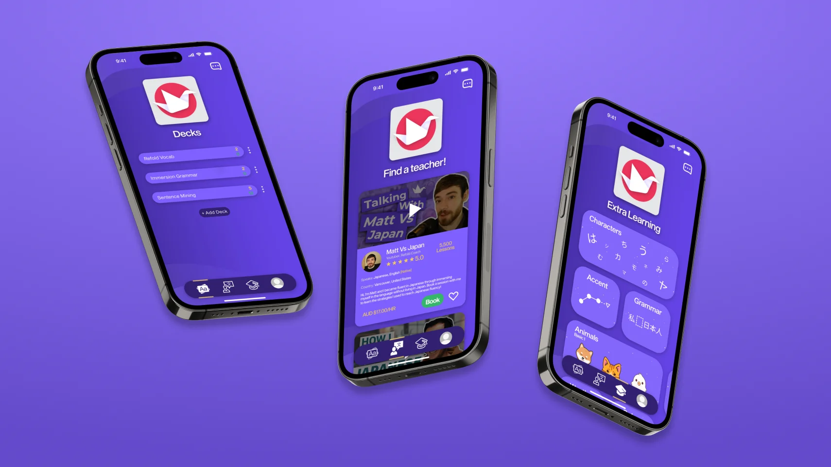
Everything a learner needs — The Refold App.
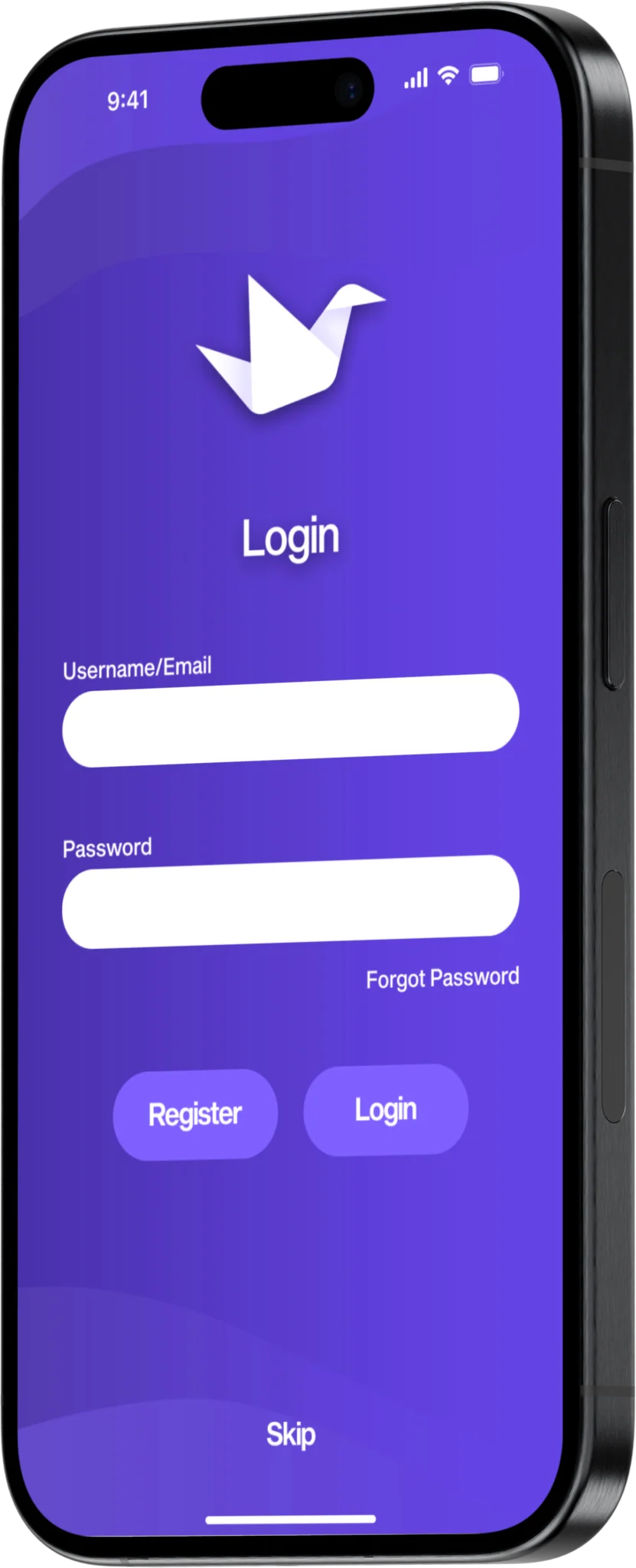
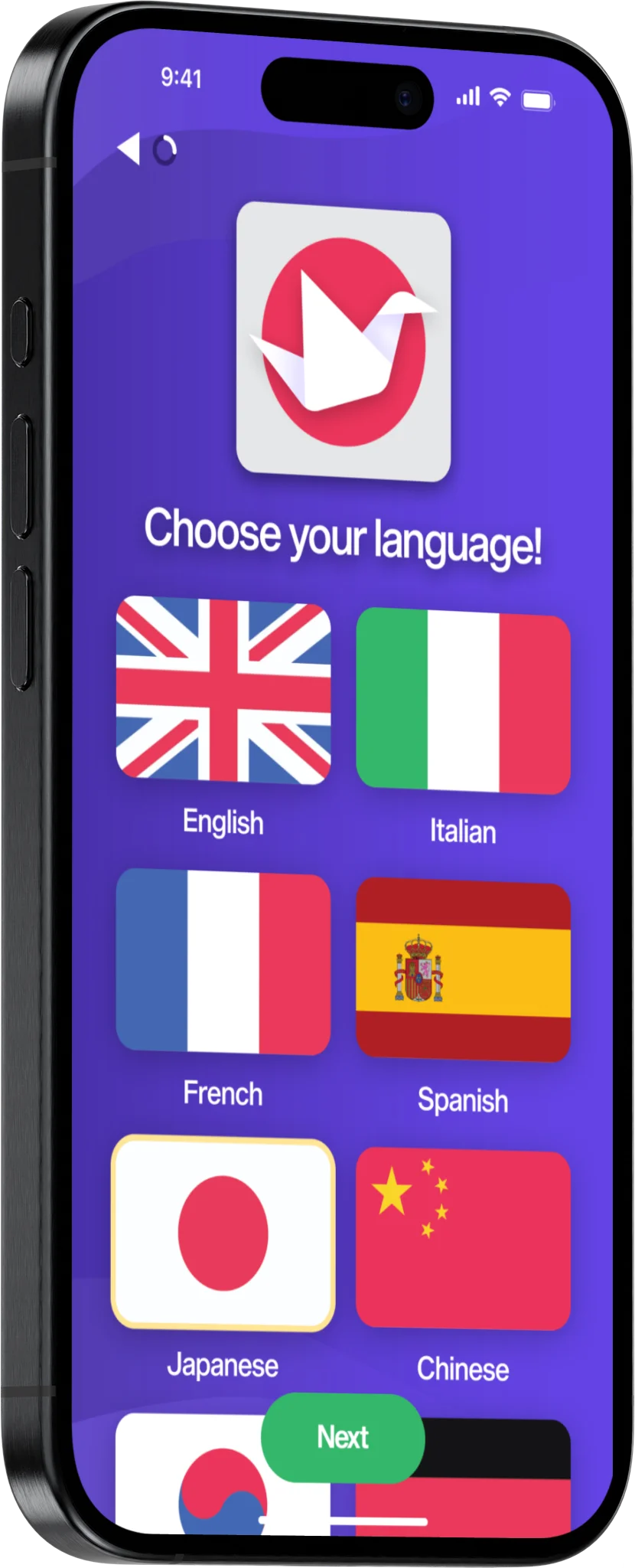
Optimise.
Create an account, choose your language and set your daily goals to let Refold optimise your learning goals for an efficient, immersive experience.
Immerse.
With tailored vocabulary and voiced sentences, learn the script and expose yourself to any language. An ‘all-in-one’ method that uses the proven SRS learning technique to help you retain long-term memory.
Grow.
Other opportunities to grow are around with an in-built community of teachers to help you. Furthering your studies has been made easier with the ‘Extra Learning’ tab, giving more knowledge to fuel your hunger.
• RETROSPECTIVE
Key takeaways
Conducting this case-study was a great learning experience and taught me a lot, from ideologies, theories, techniques and the importance of framing the perspective from the user. It taught me to TRUST the research process, and that these tried and tested techniques improve a designer’s ability to pin point problems and come up with compelling solutions that work.
I realised I subconsciously applied these techniques as an interior designer creating fit-outs/exhibition stands for clients. Conducting research, drawing inspiration from competitor's, communicating with the client, creating sketches and mapping out what worked were transferable techniques that brought a sense of familiarity when making the switch to UX/UI design.