3 months (Aug - Nov 2024)
Following the recent update with PowerPass’ app, multiple bugs and technical issues with the UI interface rendered it completely unusable, unreliable and highly inconvenient.
Working as a Trade assistant, I experienced first-hand the frustrations of tradies waiting in long queues, only to reach the register and be locked out of their PowerPass card and subsequently miss out on their trade discounts.
As a product designer, I began to question the overall design of the app, deciding to use this opportunity to craft improvements that would transform PowerPass into the reliable and quick app that our Tradies deserved.
0.1
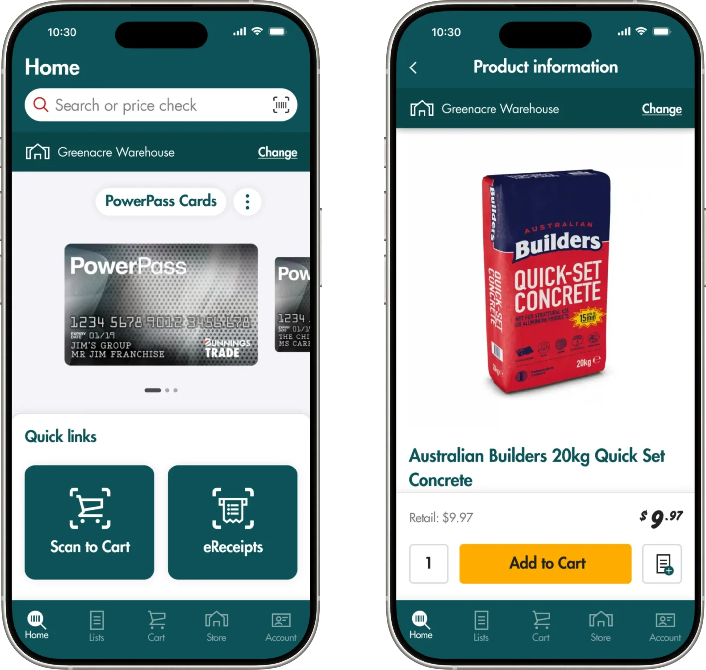
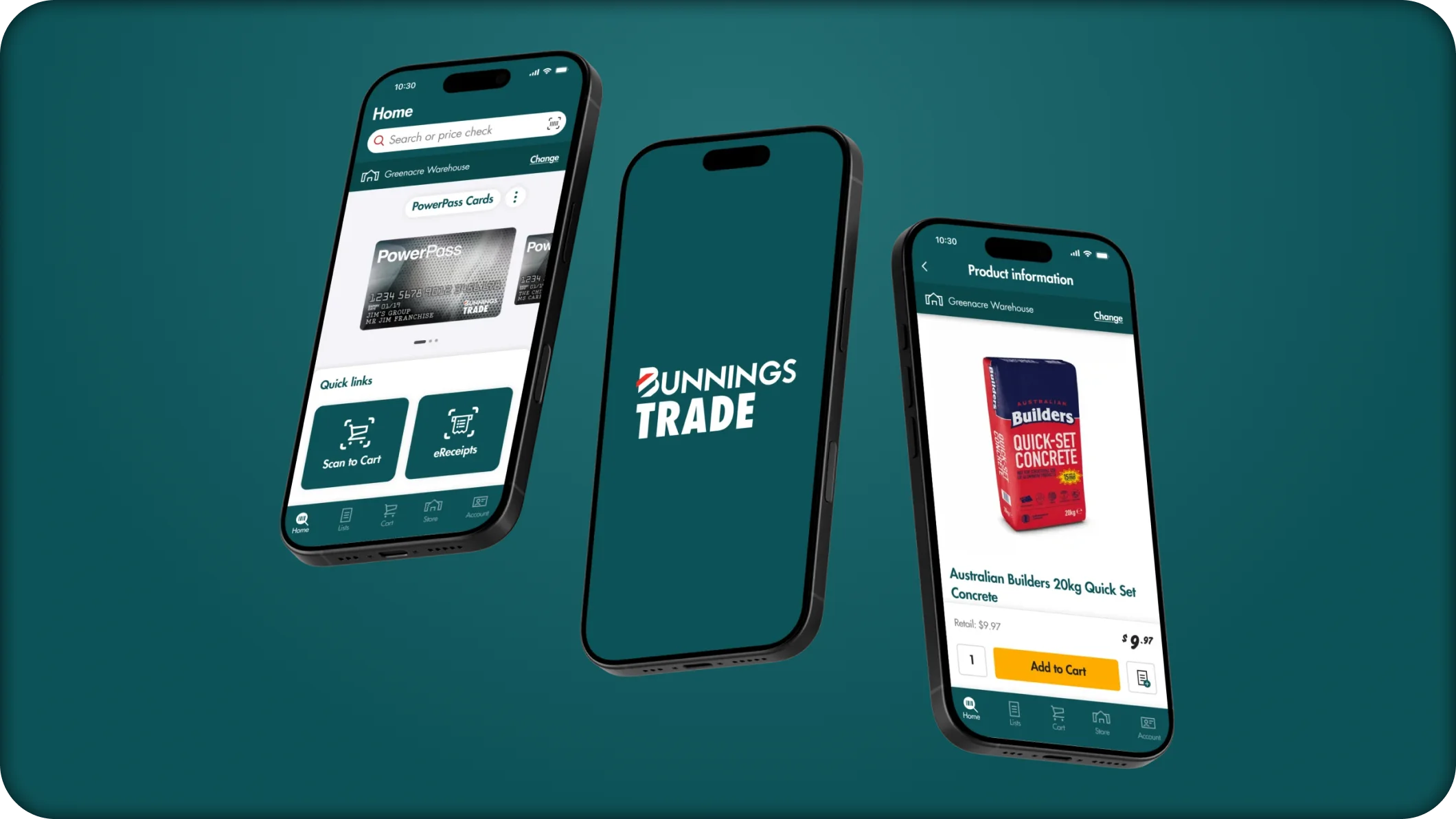
PowerPass GIF mockup.
0.2
PowerPass iPhone mockup.
0.3
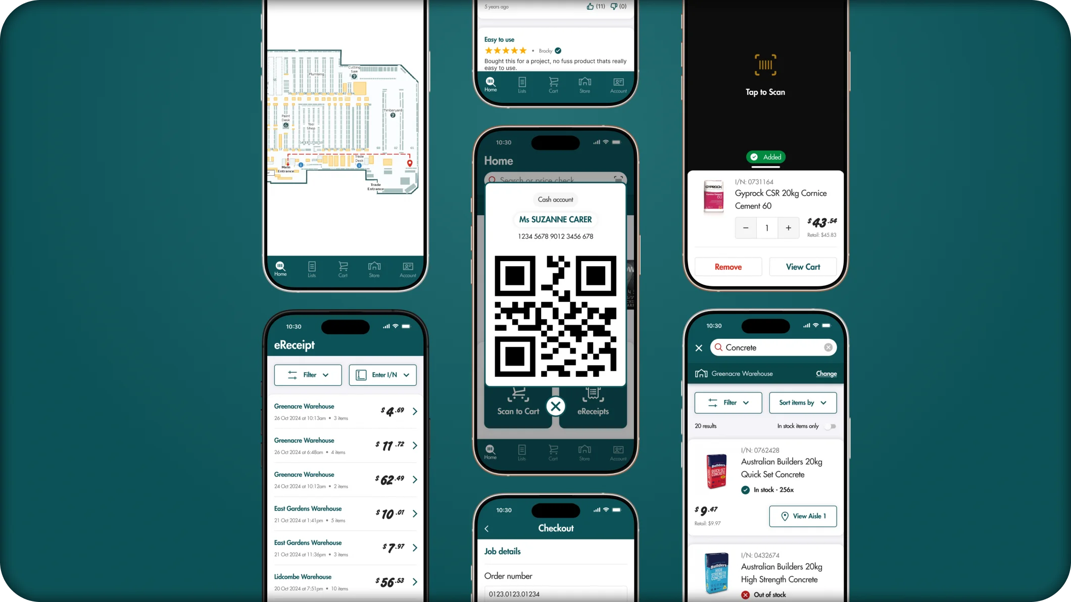
PowerPass screens mockup.
0.4
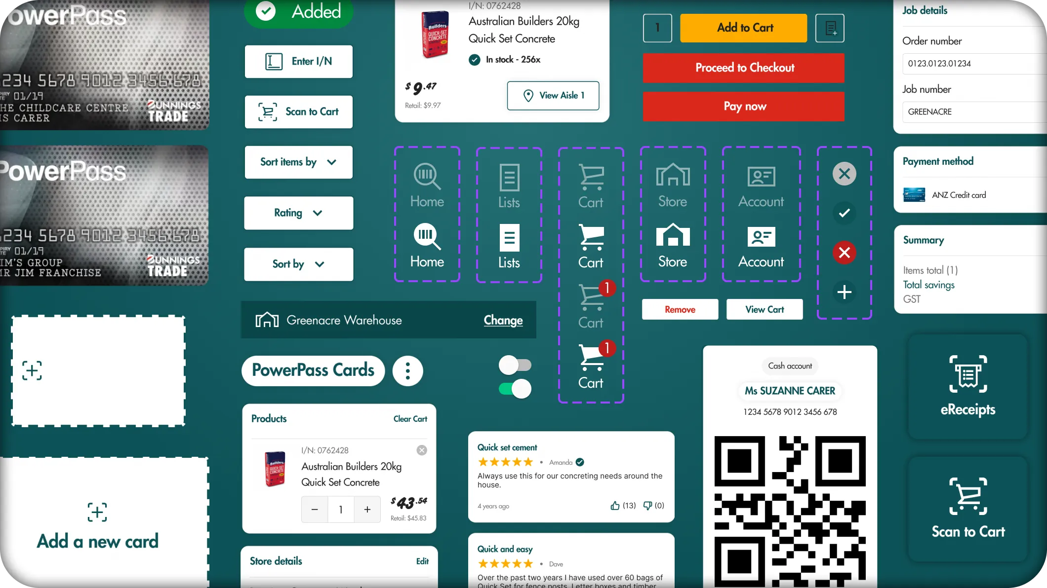
Component library.


• PROBLEM SPACE
PowerPass' execution was off to a rocky start.
A recent update that brought nation-wide issues.
PowerPass had a recent visual and function update which aimed to improve the overall shopping experience, making the process easier and quicker for Tradies to get back on-site.
However, on release, the update was met with harsh criticism from the building community.
It came with multiple bugs and UI inconsistencies, making shopping and checking-out tedious and lengthy.
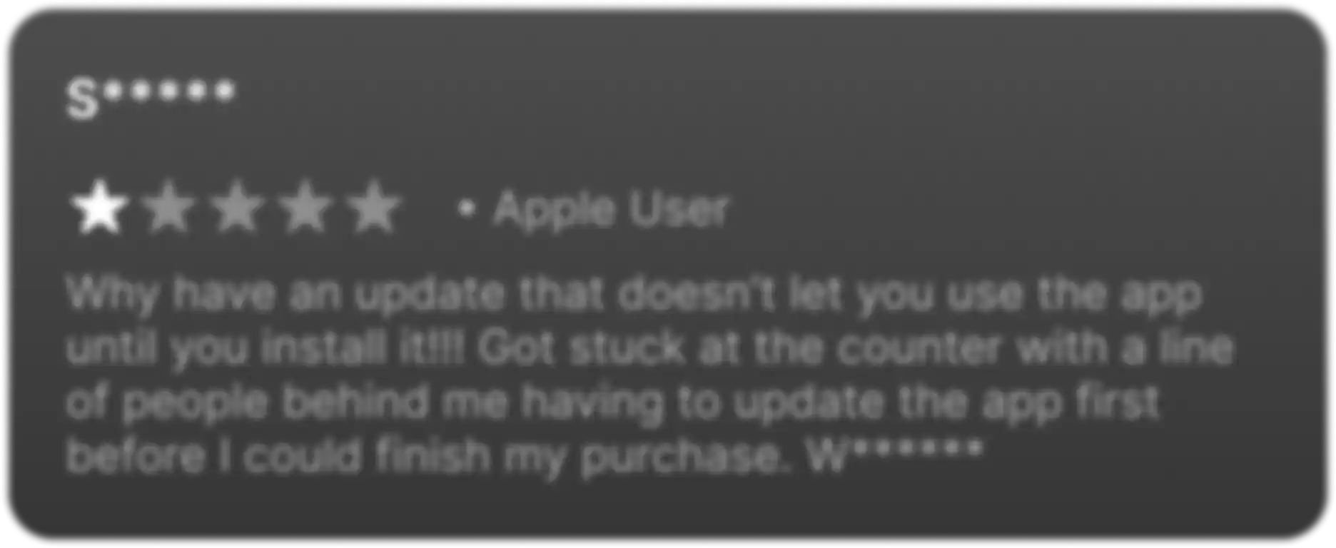

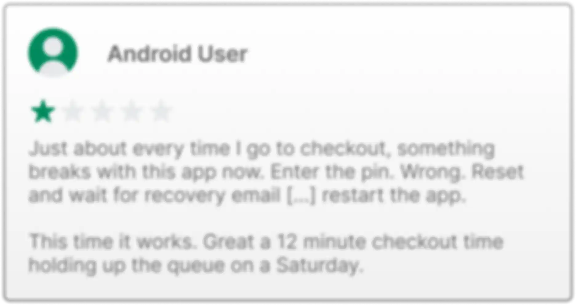

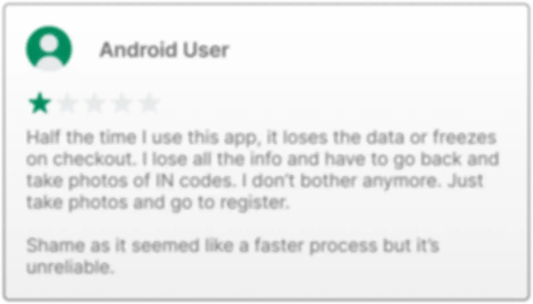

The message — Tradies no longer trusted the app.
As the person running the Bunnings trade register, I experienced first-hand the frustrations of the update inconveniencing every tradie that wanted to check out.
With constant crashes, login issues, impractical search engines and confusing digital architecture problems, our loyal customers had no reason to trust PowerPass.
It was clear what needed to be done:
Visually simplifying the UI interface to appeal to less technically-savvy users.
Quickening the architecture and making the experience straightforward.
Adding additional prompts to elevate the overall efficiency of the shopping experience.

• IDEATING SOLUTIONS
Laying the groundwork for improved shopping efficiency.
But firstly, how were tradies using the app?
I knew the PowerPass app was intended to make the shopping experience quick and efficient, but I needed to know exactly what tradies were specifically navigating to when they came in store.
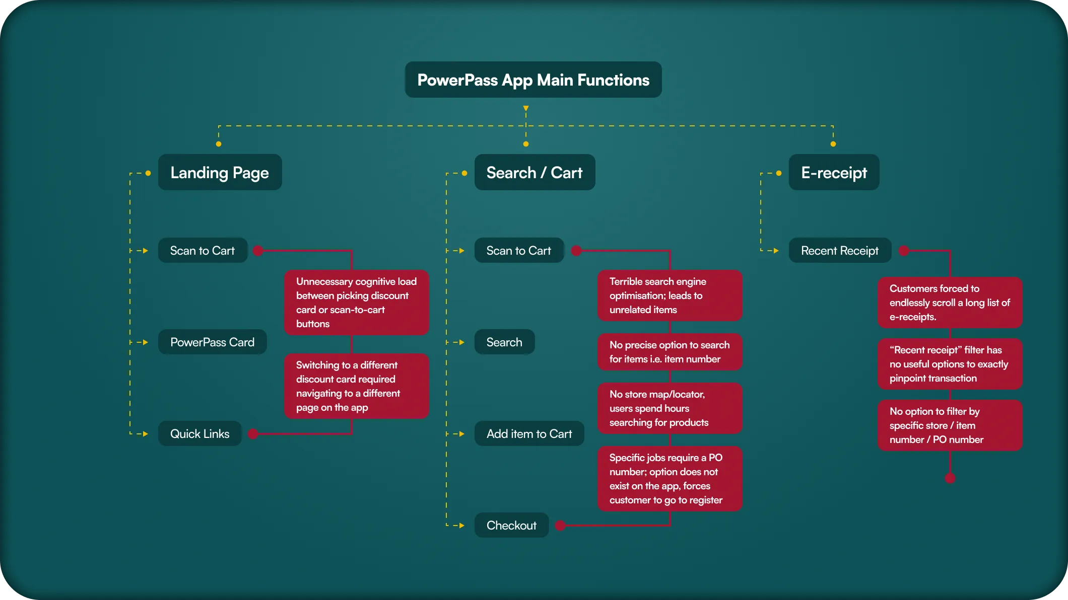
After carefully observing every tradie that used the app and where they navigated to, I noticed 3x common functions they had:
Substituting to the digital PowerPass card within the app, replacing the physical copy.
Searching and scanning items to their cart to either check-out via phone or quick check-out at the trade register.
Keeping records of their eReceipts or tax invoices in their app and avoiding physical receipts.
1.0
PowerPass main functions.
Mapping a better view of the journey.
I created a site map to gain a better angle of the entire shopping experience. The main goals were to exactly pinpoint where cognitive load was significantly high, leading to extended in-app use time.
2.0
PowerPass sitemap.
Brainstorming and sketching solutions.
I felt it was easier to ideate potential solutions by drawing them out, being able to roughly see what worked and create multiple iterations.
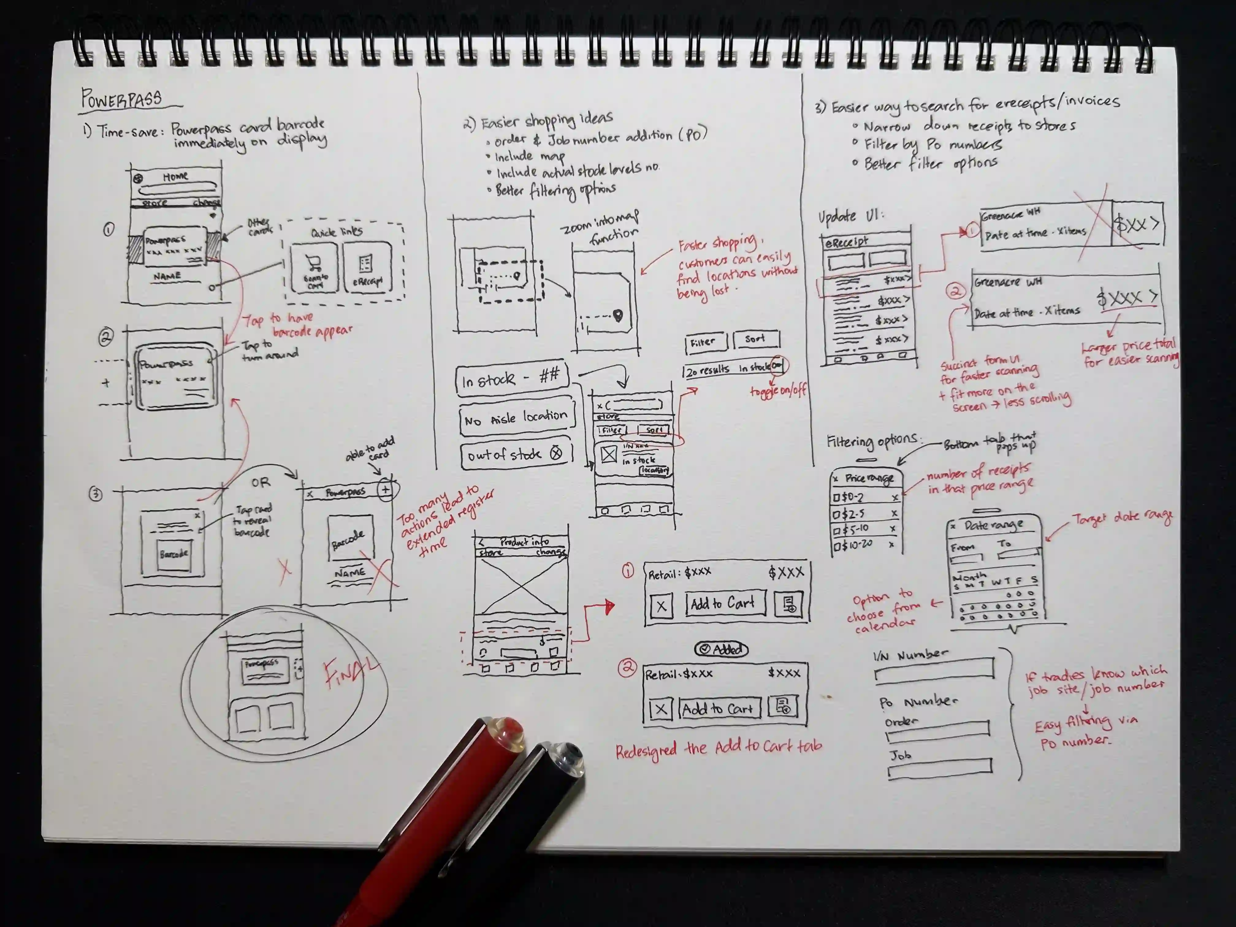
3.0
Ideation sketching
• DESIGN IMPROVEMENTS
Making PowerPass’ great features greater — and quicker!
01. It all starts with the digital card — how can they pull it out faster?
With the app now acting as a digital wallet to store PowerPass cards, the option to swiftly change cards was highly convoluted, ultimately causing delays in queue times at the register.
Tradies would also subconsciously think about choosing between the PowerPass and ‘Scan-to-cart’ box to bring up their barcode, a few milliseconds that could be addressed.
Ultimately, I decided to make the PowerPass card the main hero of the home page, supported by a swipe feature for ease of adding or swapping cards.
I also made the 3x common functions accessible as quick links that were easily scannable.
4.0
Current Home screen.
Remove PowerPass and ‘Scan-to-cart’ button — causes unecessary cognitive load.
PowerPass text in button failing to respond to smaller screen resolutions.
4.1
New Home screen.
Swipe function to easily add or access multiple cards.
PowerPass card as it’s own hero section helped decrease cognitive load.
Quick links decisively placed for ease of clicking with thumb position — no scrolling needed.
02. Quick shopping — encouraging our tradies to NOT go to our registers.
Even with sub-departments making item organisation easier, tradies still lost valuable time tracking them down. I added better filtering options, aisle locations, item number searcher and a live map locator in the search function to significantly reduce item search times.
When companies require a PO number, tradies traditionally have to go to the trade desk. With the new order/job number addition on check-out, tradies will now be able to pay on the go and skip the queues.
5.0
Current Product search screen.
Limited options of searching for items i.e. item number, key words.
Terrible filtering and search engine optimisation — too many item results.
Checking-out at the Trade desk register.
5.1
New Product search screen.
Aisle locations and live map locator — faster shopping.
Ability to input PO numbers when checking out on the PowerPass app.
Item number search giving customers freedom to search what they know they want.
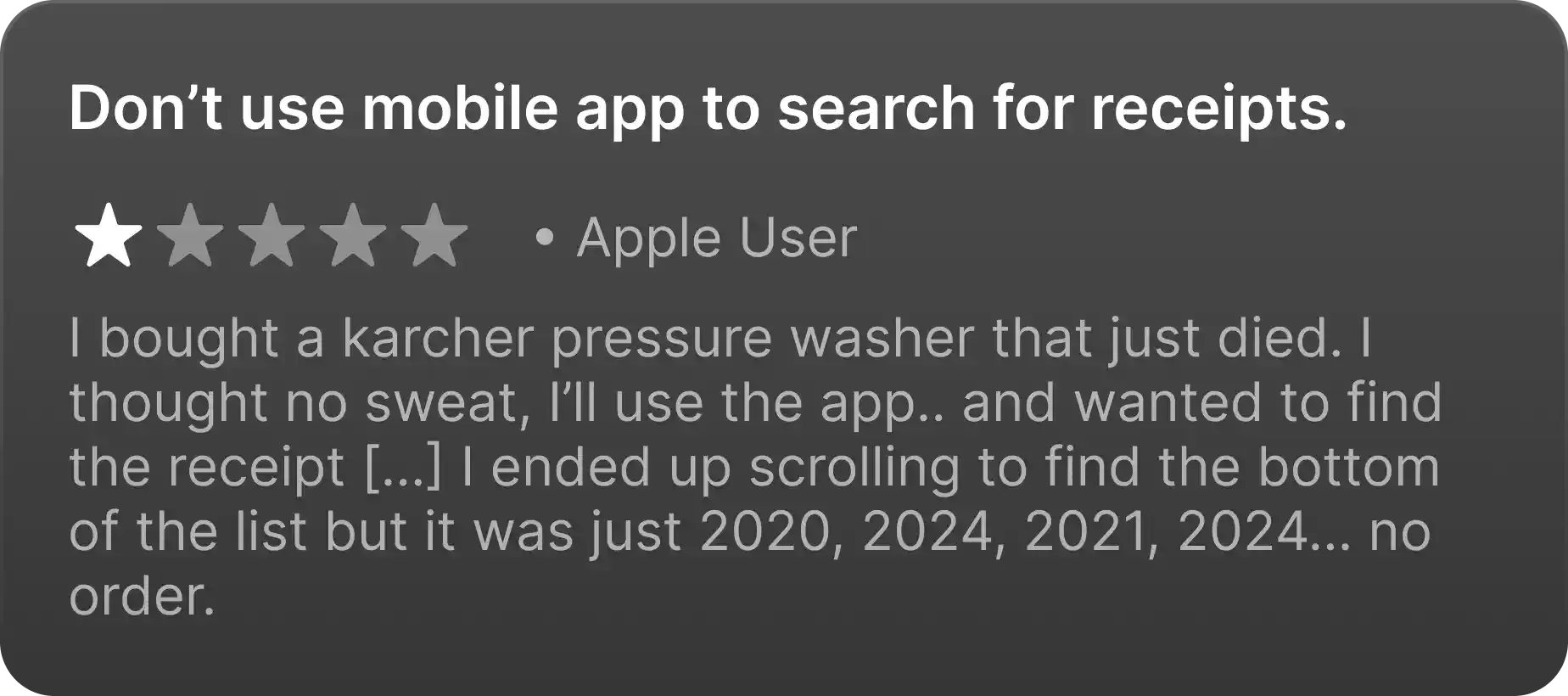
03. Why is finding my invoice so hard? — an eReceipt optimisation.
Receipt searching was notoriously terrible, displaying all receipts in an endless straight column with no option to filter through months of past invoices.
I implemented 4x different filter options; price range, date range, specific store and item number choices, giving tradies freedom to find the exact receipt they were looking for.
6.0
Current eReceipt screen.
Forced reset of scroll position after viewing receipt — inconvenient and cumbersome.
Useless filter options that lead to endless scrolling.
6.1
New eReceipt screen.
Filter by range of price, date and item number — easier and quicker to pinpoint invoices.
Narrow down by receipt from specific stores.
Filter by company purchase order number.
Additional UI updates for a seamless experience.
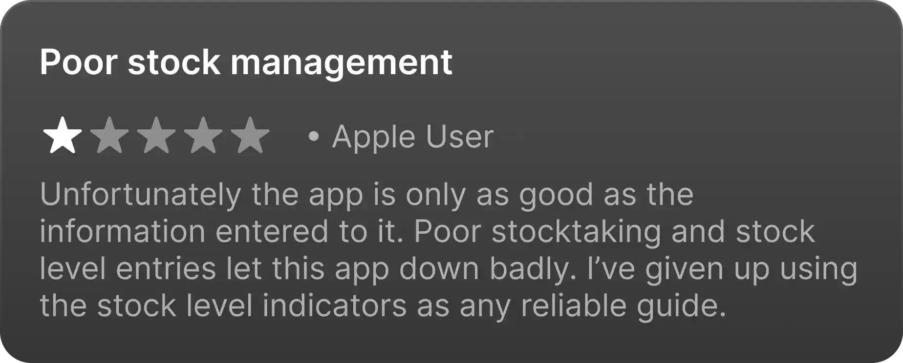
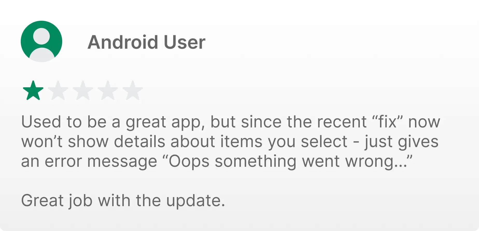
Understanding that tradies aren’t technologically savvy, the sole purpose of the app was to make their life easier. They didn’t care about cool graphics or interactive screens — if it did what it needed to do, they were satisfied.
That meant making the UI as simple as it could be. So simple that even a toddler could traverse the app with no problems. I added the following functions to elevate the app experience:
Option to view reviews for item transparency.
Scanned item pop-up display refresh.
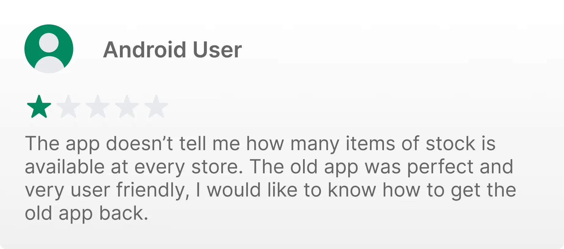
Show stock levels of item, instead of blindly saying ‘In Stock/Out of Stock’.
7.0
Additional UI redesigns.
• RETROSPECTIVE
Retrospective — an awesome solution for my customers!
Project takeaways.
Criticism = Opportunity
Without criticism, a product is doomed to fail. Being surrounded daily with tradies expressing their frustrations first-hand positively influenced my empathy and align my focus on the imperative issues.
Design for the right customer
If a customer wants speed and function, design to accommodate that market. Understanding that tradies don’t care for beautiful UI helped speed up the project.
You don’t have to keep it traditional
Not every project has to be approached with the typical ‘Double Diamond’ process. It’s not wrong to be traditional, but being flexible and versatile in your approach is just as creatively important.